Data-Driven Product Design at Torob
Company: Torob
Products: Torob Website and Android App
My role: Product Designer
Team: 4 Engineers, Founder, Myself
2020 – 2021 (2 years)
Introduction
Torob is a shopping search engine that allows users to find the best price of products in online stores in Iran. Users can compare prices and shipping options. In the following, I've described my works at Torob in chronological order.
Case 1. Redesigning Interface Of Website and Android App
Case 2. Improving Search Experience
Case 3. Renovating First Impression Experience
In these cases, 4 great engineers make it possible to follow a data-driven design approach in creating a brand new Torob.
Case 1. Redesigning Interface Of Website And Android App
My first work at Torob was redesigning the interface of the Android app and website. There were some known problems in the user interface which affect the users' experience and key metrics of the business.
Problems
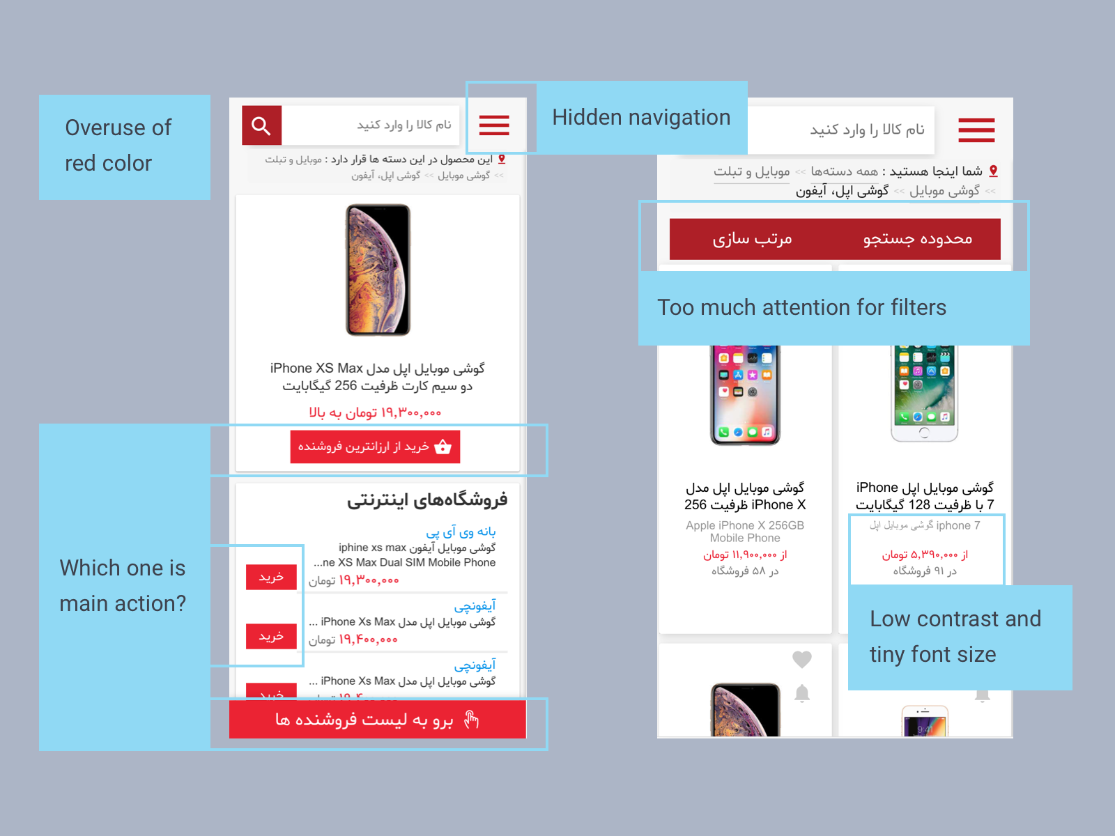
Visual Inconsistency: Torob didn't have a style guide for design and development and it caused a wide inconsistency in the website and Android app. On some pages, it was confusing for users to find desired links and main actions.
Poor Navigation: Putting navigation in the back of the hamburger menu made it hard to find that.
Sketchy Responsive Design: Half of Torob traffic comes from Google via mobile devices. The landing pages for this huge traffic were not optimized for fast loading and needed a more light and clear design.
Poor Readability: Some important text had low contrast and a small font size.
Overuse Of Brand Color: The over use of red color made it hard for users to detect main actions and cause a feeling of errors on pages.
Solutions and Tests
1. Developing UI Kit: We developed a UI kit for Torob to help us to keep consistency through all products. After designing fundamental UI elements, we designed pages with high fidelity and keep developing them for new features and adapting them for Android application.
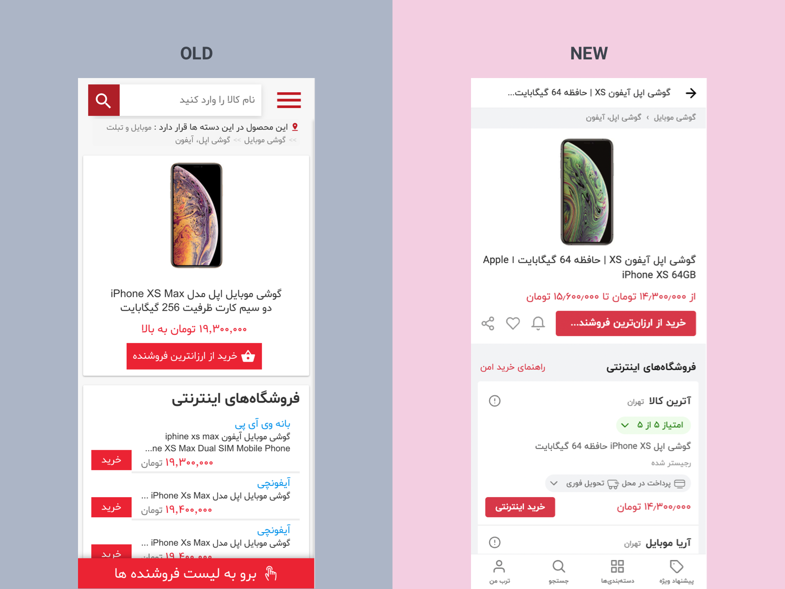
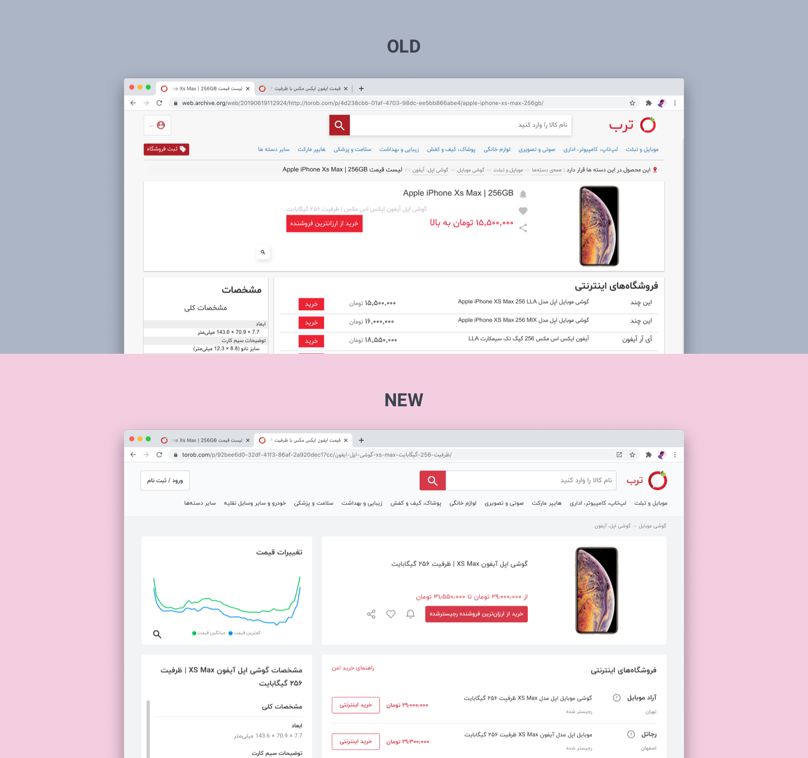
2. Visual And Navigation Improvement: We replaced the hamburger menu with the bottom navigation bar and used a less saturated red color for main actions. The Below image shows visual change on the product page in mobile view and desktop.
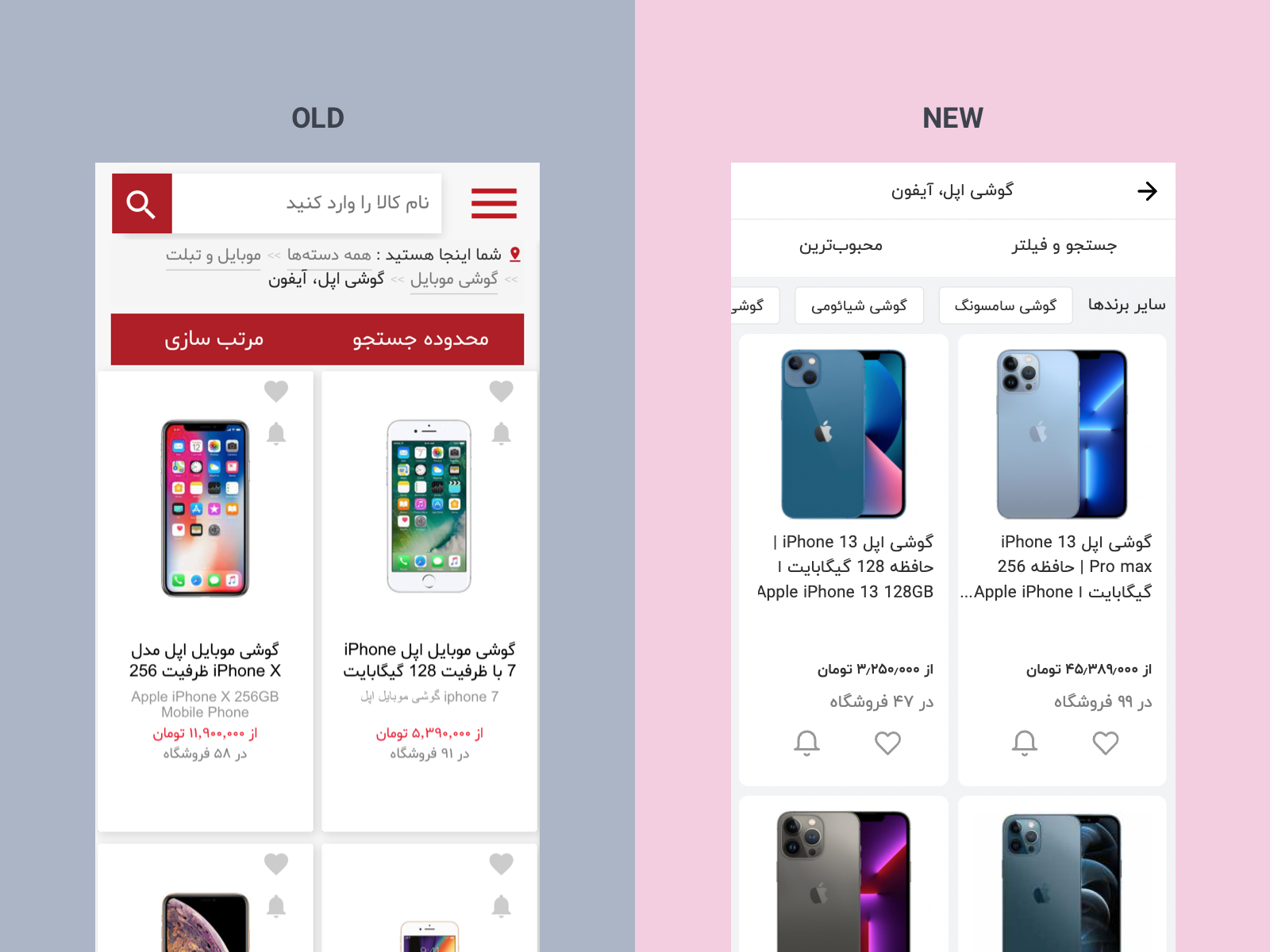
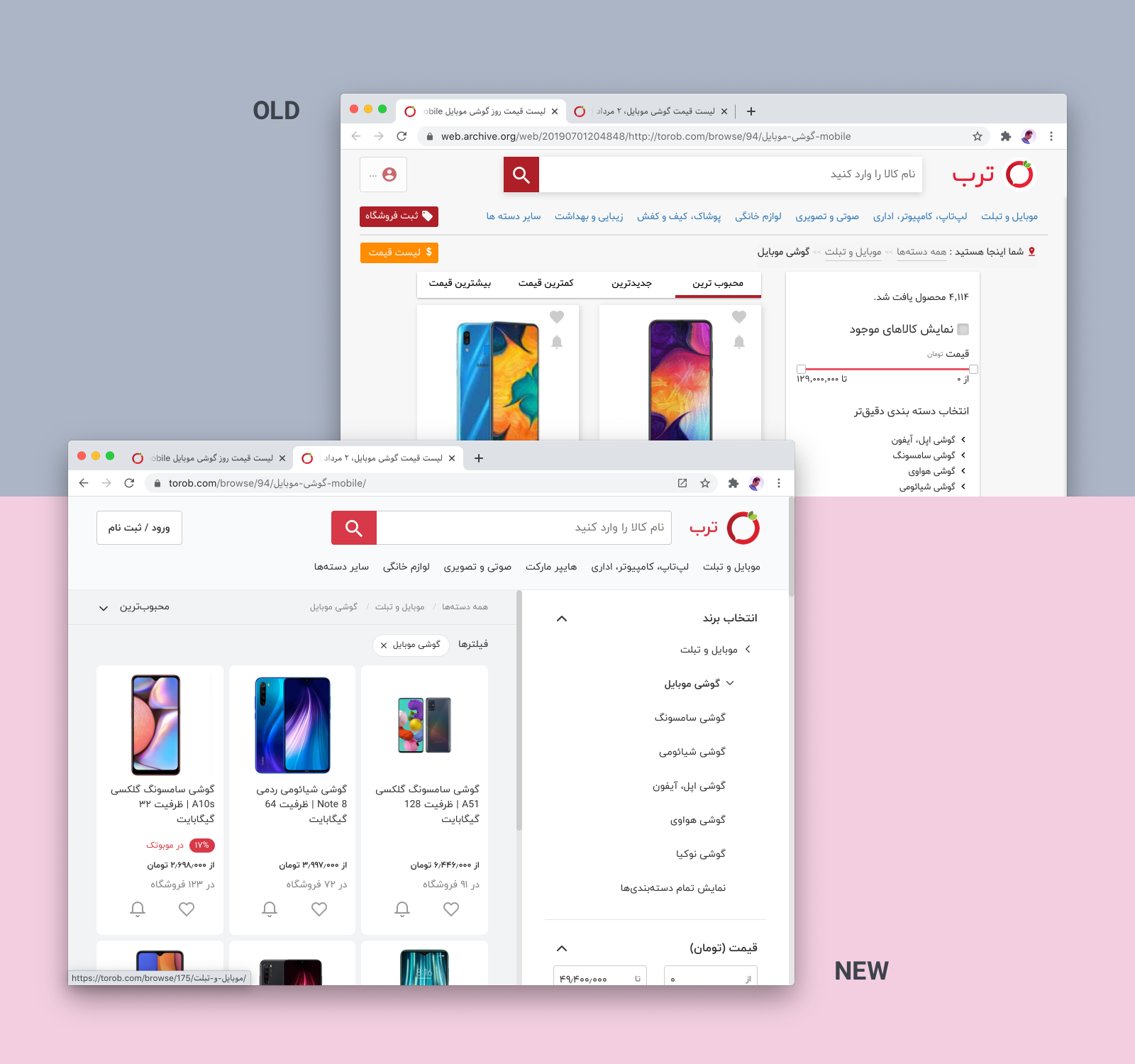
The following images show the new look of the browse page in the mobile and website.
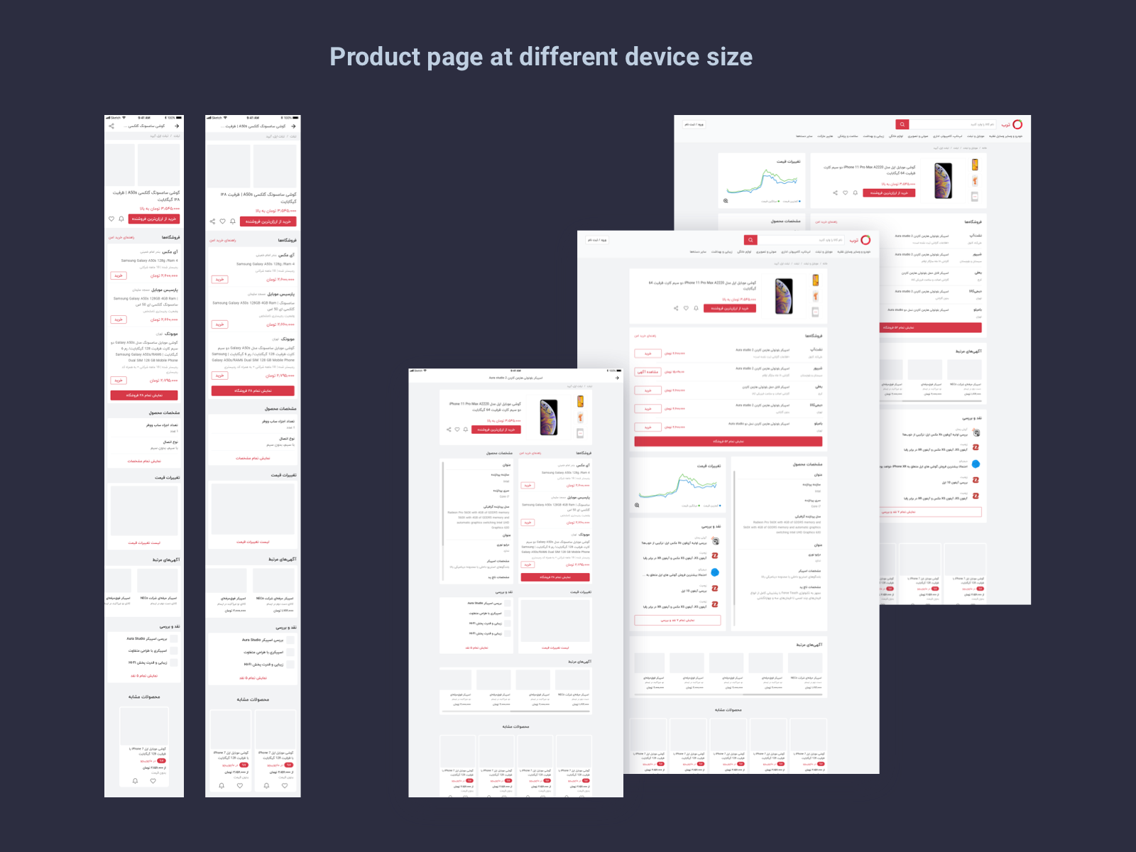
3. Improved Responsive Design: Torob website is seen by a wide range of different devices. The “Product Pages” are the most important page on the Torob website. 80% of users see at least one product page in their sessions and 95% of Google searches are directed to these pages. So we considered a wide different screen sizes in the design to ensure a seamless experience for all users.
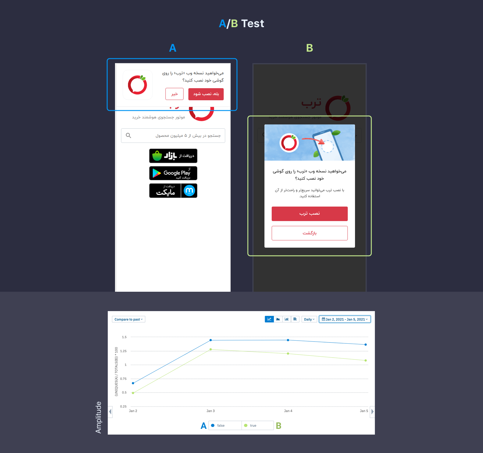
4. A/B Tests: We did a lot of A/B tests on visual designs to ensure the new design didn't have negative effects on critical metrics. For example, in the following chart, you can see a test on the store card on the product page. We wanted to know the effect of linking the store name to its profile on Buy Button clicks. It was a tiny visual change of the store's name but it caused a 14% drop in clicks.
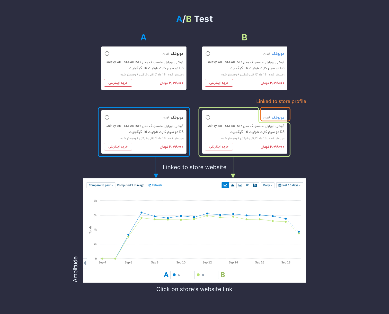
We did other similar tests like Buy Button color, adding the city of the store, adding shipping info which help us to make better decisions on the design process.
5. Gradual Release: We tested the new design of Torob on the desktop website which had about 15% of all traffics and monitored critical metrics for 2 weeks. After that, we released it for all web users. We had the same approach for the Android app and used Google Play Staged Rollouts to release new designs gradually. During releases, we worked closely with the customers' care team to follow the comments of users on the Play store and social networks.
6. Collecting Data: We needed data to understand users' behaviors and measure the effects of new designs. We used Amplitude for short-term testing and our database for collecting long-term data. Also, we did some surveys to understand personas and continuously observe users' behavior to adapt design based on their needs.
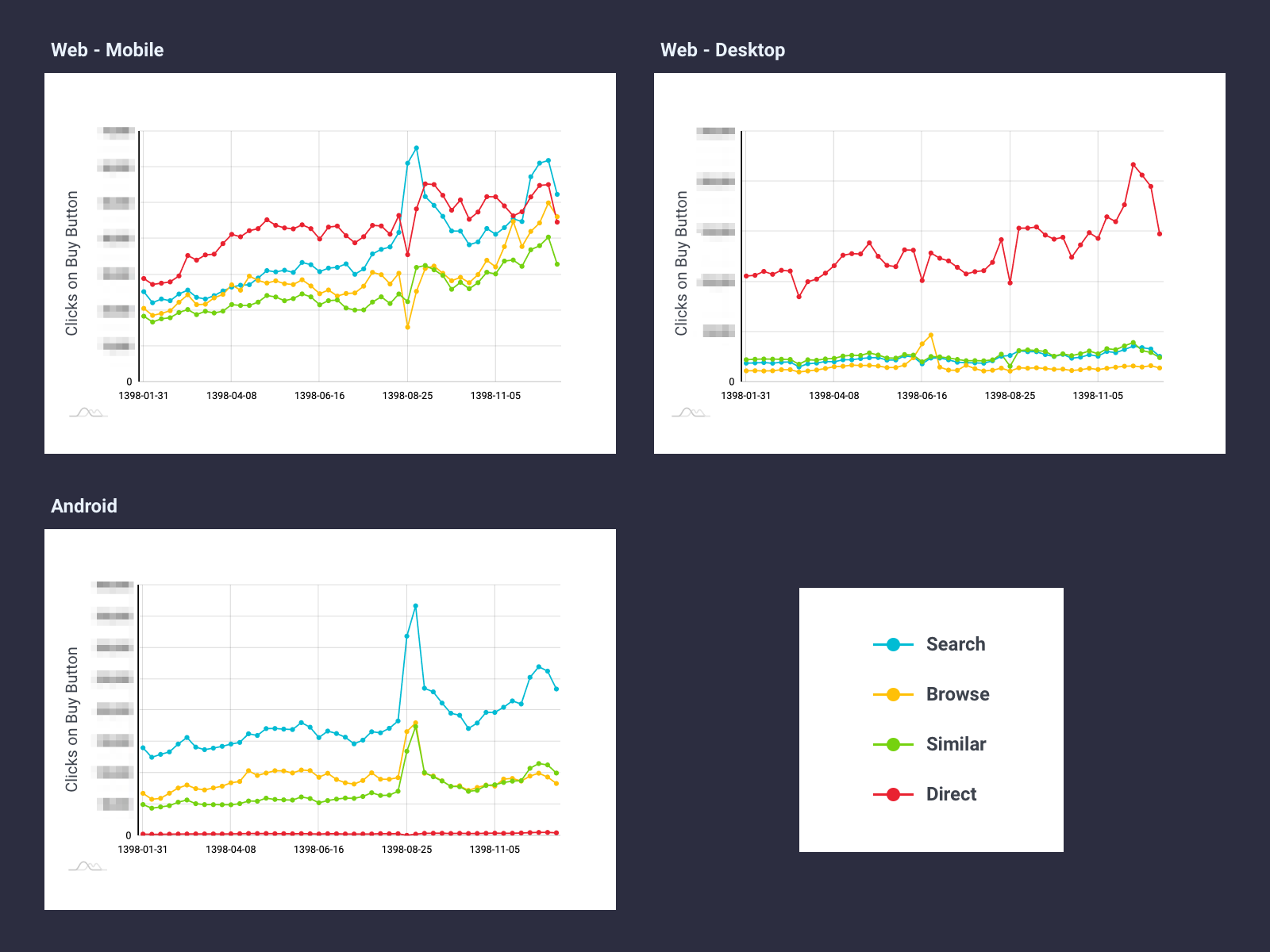
6.1. In the below chart you can see how users reach their desired products through the different sections of the Android app and website. From this data, we understood every platform observes different persona and users have different behaviors on them. So we should consider different designs for every platforms.
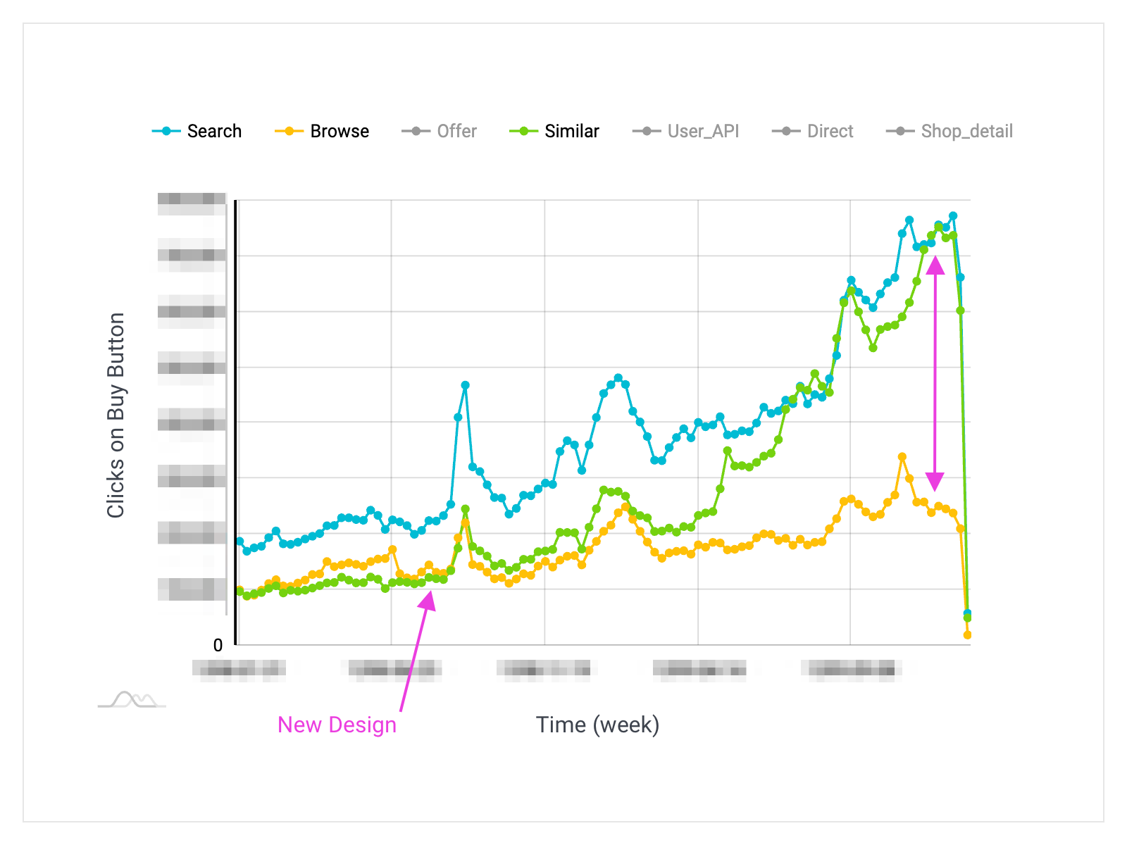
6.2. Similar Product: We found how a small change in UI can have a dramatic effect on business metrics and users experience. Similar products was a section at the bottom of every product page. Previously the Similar section showed limited numbers of products and we tested an infinite scroll section. In the below chart you can see its dramatic effect on Buy Button's clicks on overall web and app platform which is directly related to revenue. The new design also had a positive effect on sessions time.
Case 2: Redesigning Search Experience
Introduction
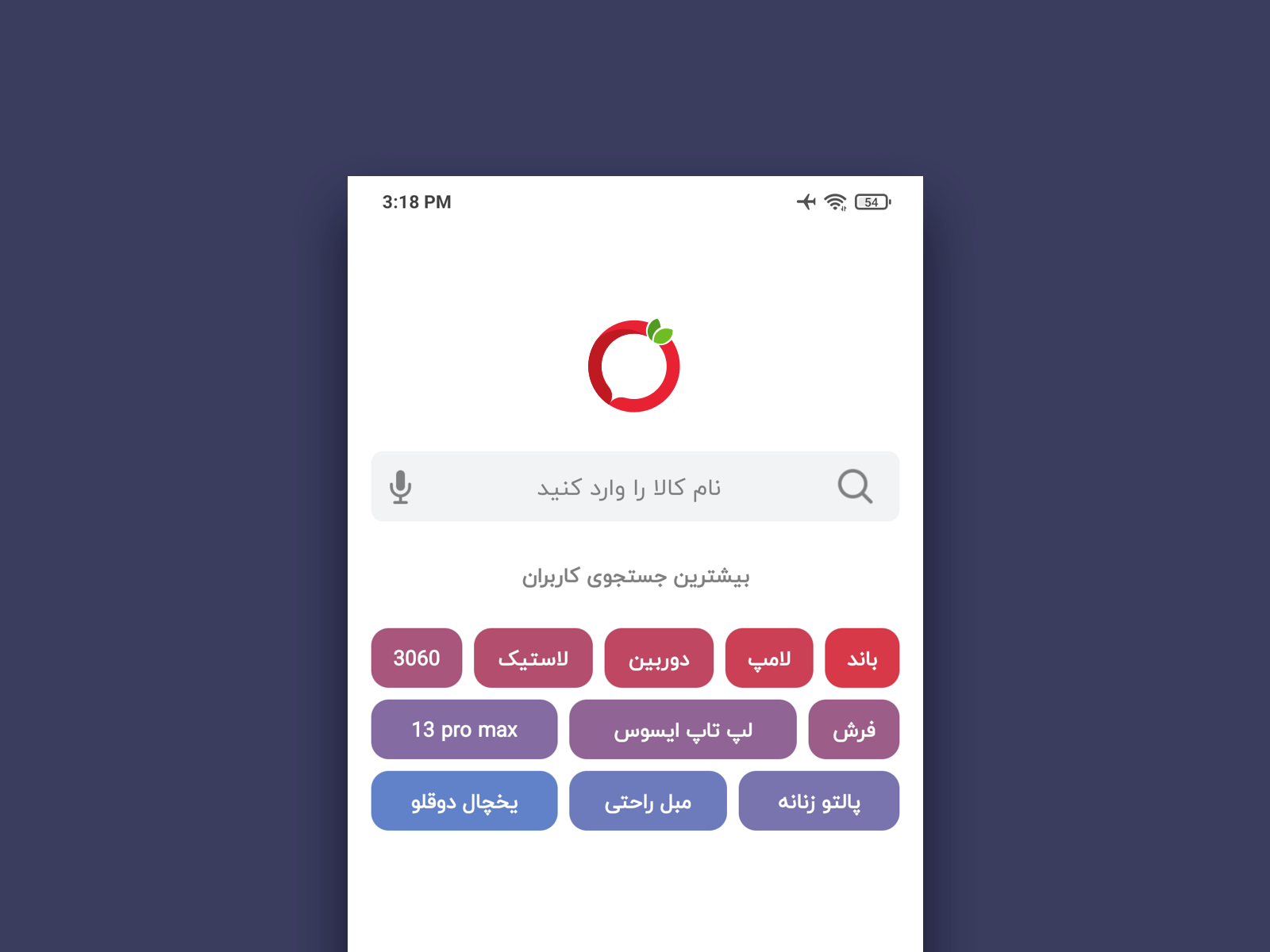
Data from our first studies (as explained in case 1) showed more than 65% of products visits did through searches. So we decided to consider Search as the first step for UX improvements after UI redesign. The following figure shows the old design of the Search Tab in the Android app. It showed an infinite list of top visited products from the previous day and by typing in the search box, the users saw Suggestions by categories and text. During initial studies, we found some problems and issues and tried to solve them.
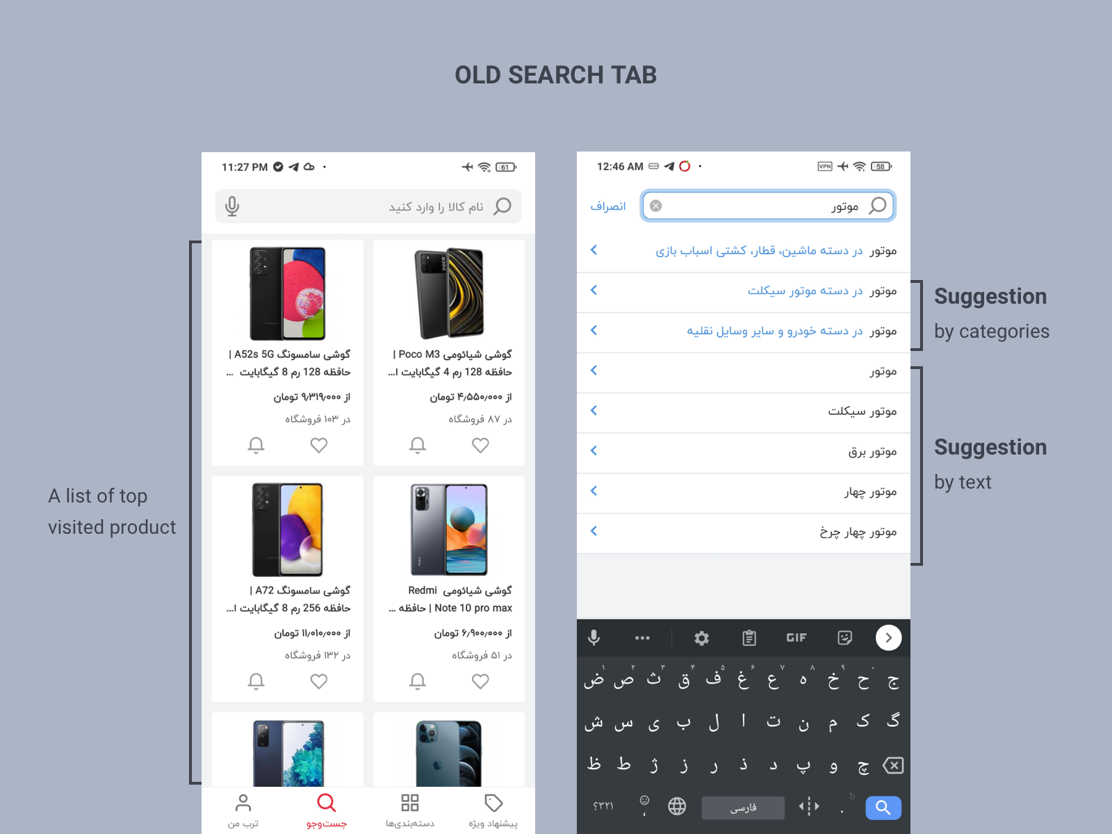
Problems
No reaction to new products, events, and trends: We found the Torob app doesn’t show any reaction to new products and trends in the market. Torob missed or showed delayed reaction to short events like Black Friday or seasonal auctions. For example, we trace PS5 in the first days of its release and found that users couldn’t see any trace of it in the app except by searching the exact name of it. Also, the list of top visited products in Search Tab didn't show any trace of new products except for some new mobile phones. Because mobile phones were the most visited category in Torob and always got top places in the most visits products. At that moment, the current algorithm just considered absolute values of all product visits, so it couldn't detect trends and growth of new terms in the search.
Poor UX of Repeated Searches: Considering similar services and best practices of big shopping websites showed users do a lot of similar searches during different sessions. Torob didn't have any facilities for repeated searches in the old design.
Solutions and tests
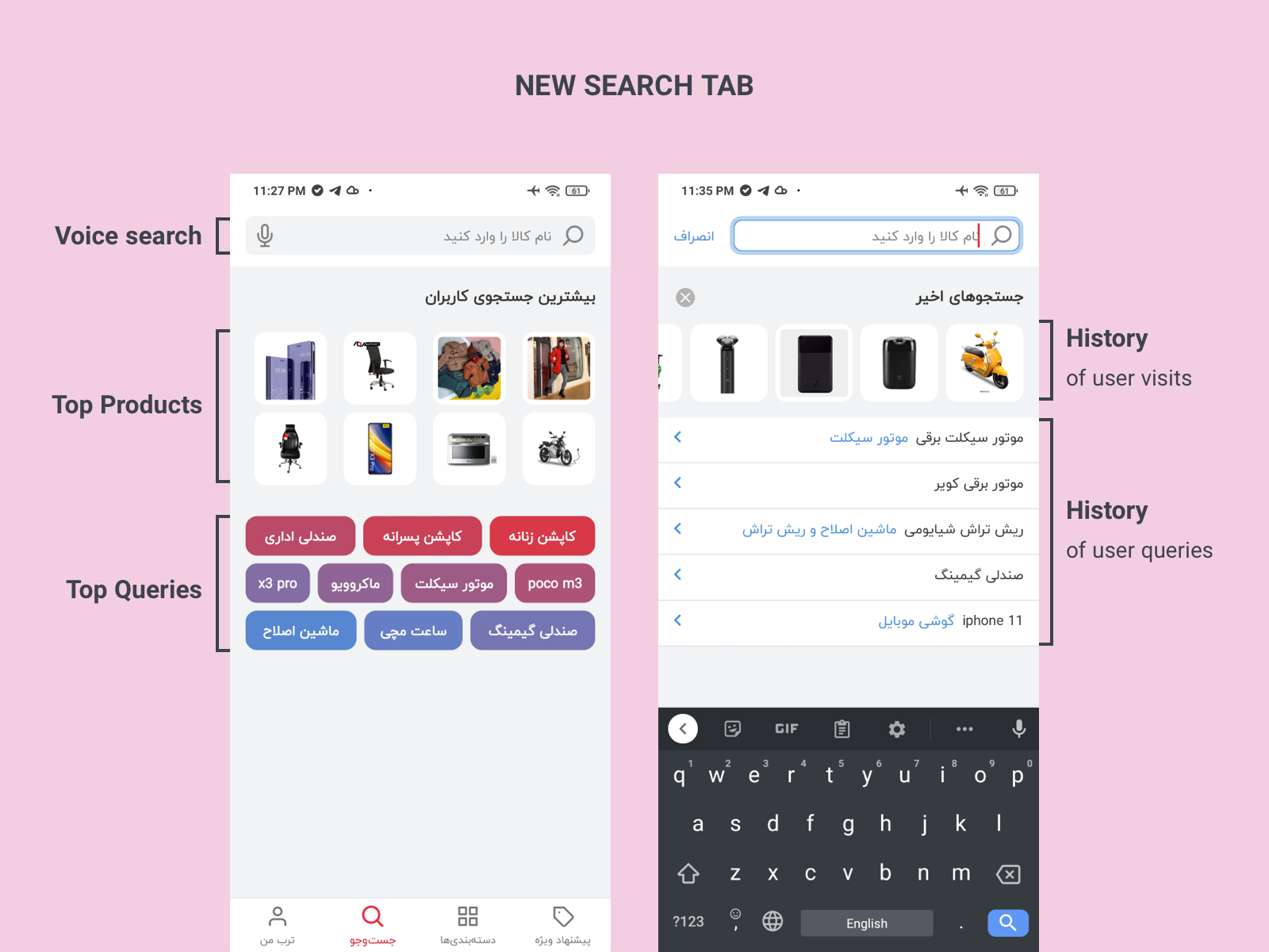
We decided to use users' search queries and product visits to detect trends and growth of new queries and show them to users. It could show users that Torob is an alive and up-to-date place for trends. As seen in the following figure, we replaced the list of top visited products with two sections. The first section represent products from the most visited categories through search and the second section displayed top and trend queries from the previous day.
To improve the experience of repeated search, we added two new sections to the user's searches history: the history of products that the user visited through searches and the history of user queries.
To test the new features, we released a test version with a new design for a limited group of users by Google Play and using Amplitude to measure events. We define two events for every search type:
- Product Visit (PV): Opening a product page
- Buy Button (BB): Clicks on Buy Button on the products page. This button is the main action in the product page that redirects users to the seller website and Torob charges sellers for clicks on this button.
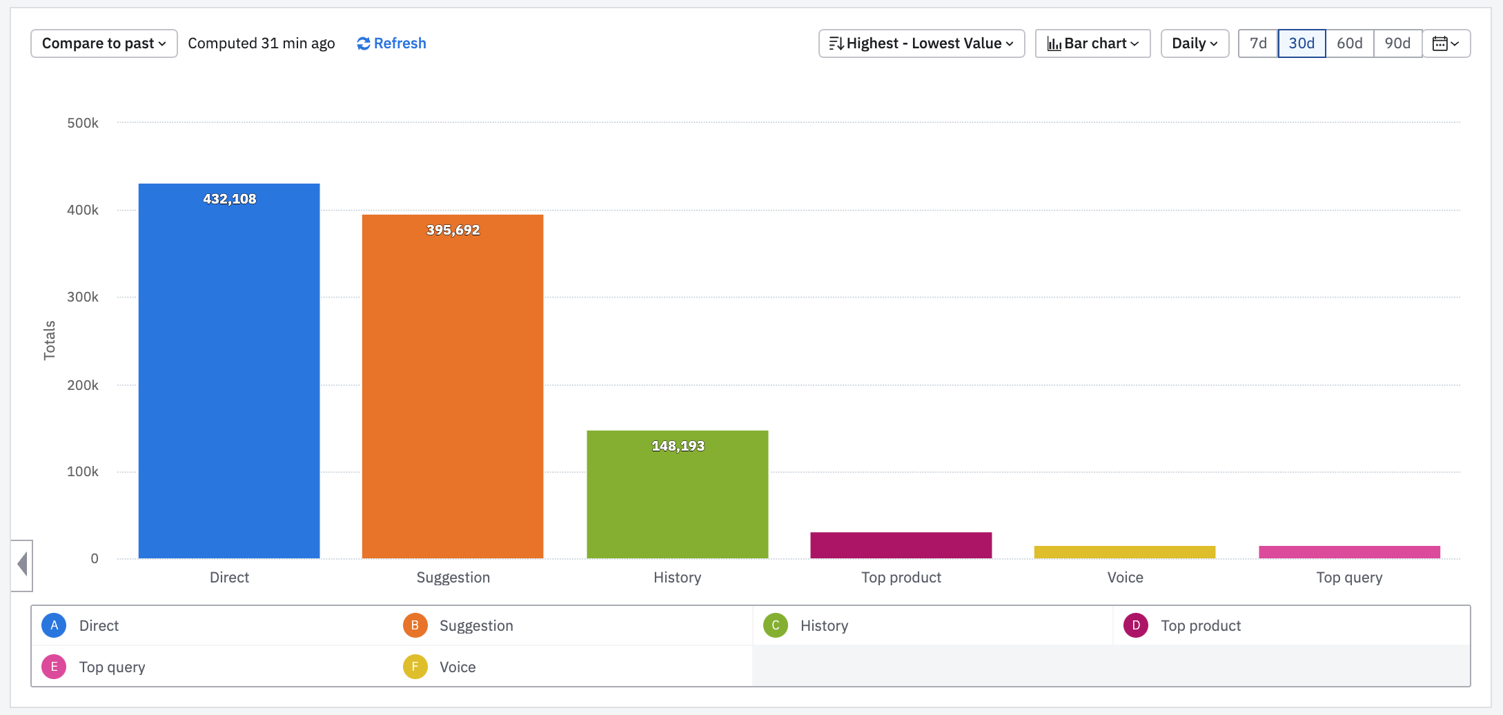
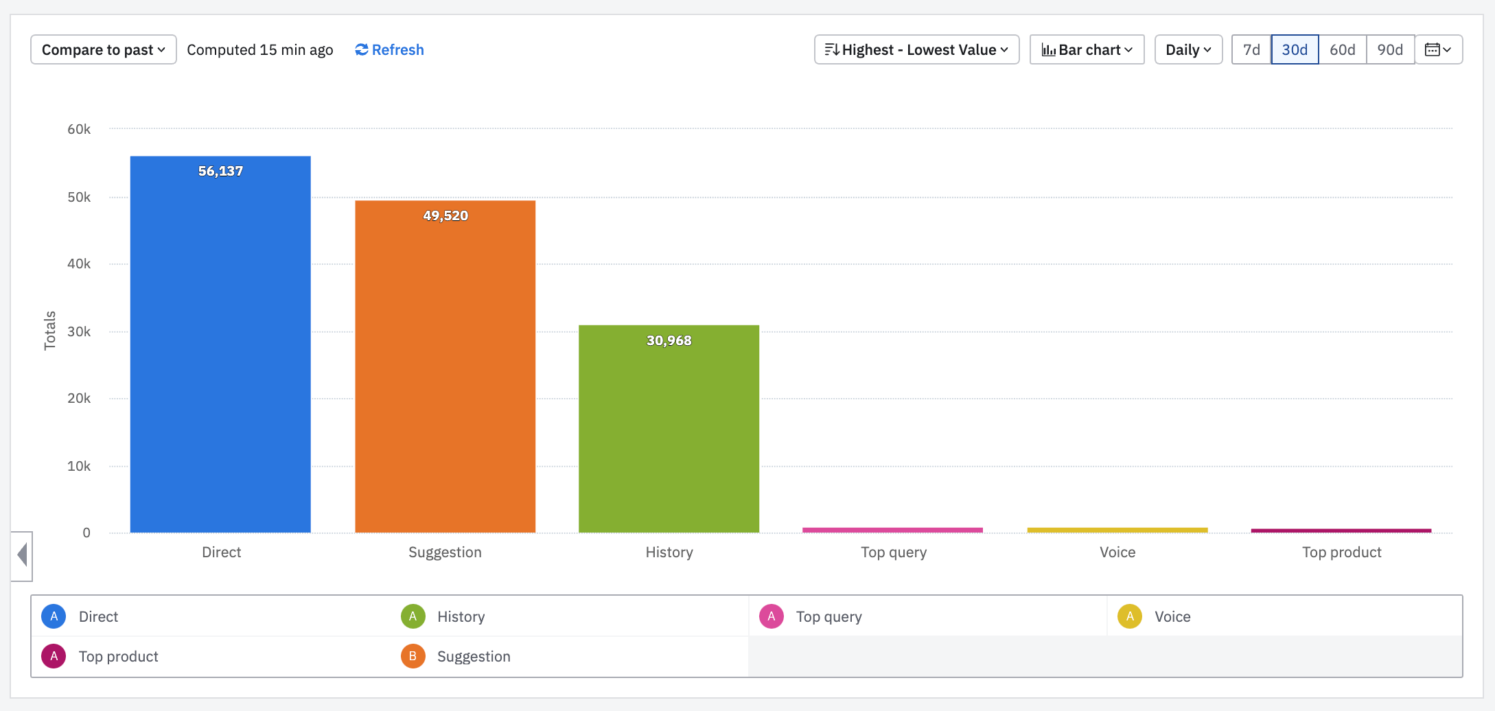
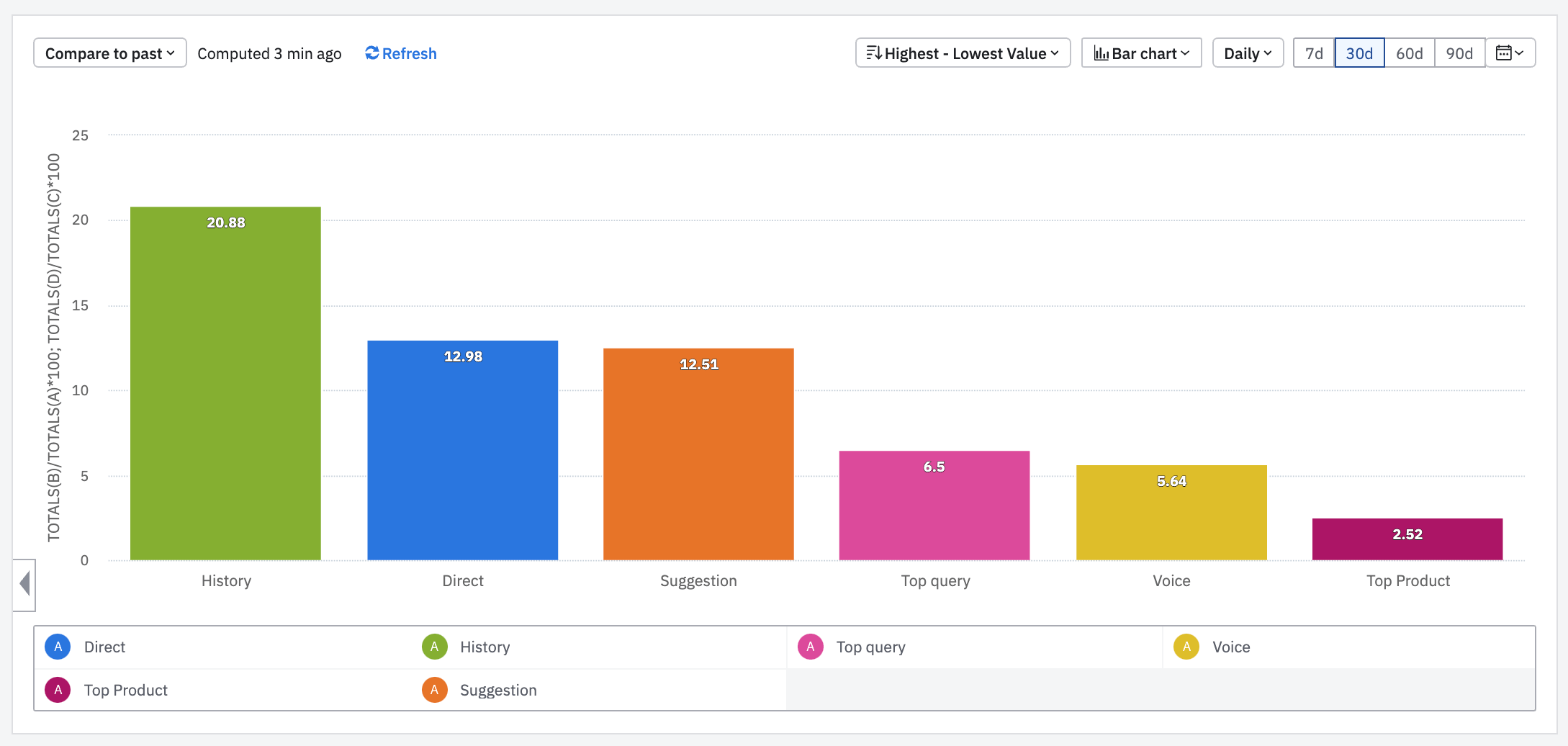
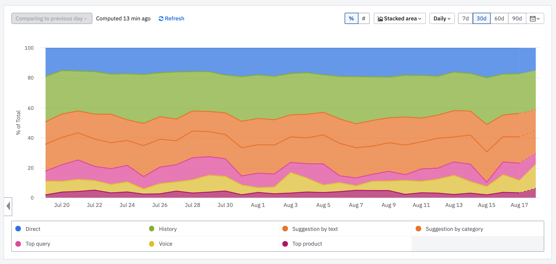
The following charts show data for 30 days of the test version which was released for 10 percent of users. In every chart data is grouped by different search types that defined in this way:
- Direct: User hit the enter key after typing in the search field and don’t choose any suggestions.
- Suggestion: User chooses a suggestion after typing in the search field.
- History: User clicked on his/her history search.
- Top product: User clicked on top product images.
- Top query: User clicked on top queries text.
- Voice: User searched by voice command.
The chart below shows Product Visit (PV) based on search types.
This chart shows total events of clicks on the Buy Button (BB) grouped by search type.
Top Query and Top Product has only about 5% of total product visits but if we look at the conversion rate (CR) of search type (BB/PP, ratio of click per visit) in the below chart, there is not a great gap between search types. CR shows how many product visits converted to clicks on Buy Button.
Results
Rise In Queries: We got a more than 5% stable rise in total queries after releasing for all users. Top Queries and user search History had the main parts in this rise.
Reaction To New Products: Now Torob shows reactions about new products by Top Queries. User finds it quickly after opening the app and it encourages them to know more about new products. It has a positive effect on the retention of users and encourages them to come back for knowing about new products.
UX Improvement Of Repeated Search: The number of Product Visits via the history of user searches shows a great improvement in UX of search. It showed that Torob users do a lot of repeated searches which previously was forced to type them every time.
Last but not least achievement was about marketing. We found Top Queries very helpful for the marketing team. In case 4, I explained more about a co-op between the product and marketing team and its effect on Torob revenue and the experience of users.
Case 3. Renovating First Impression Experience
Problems
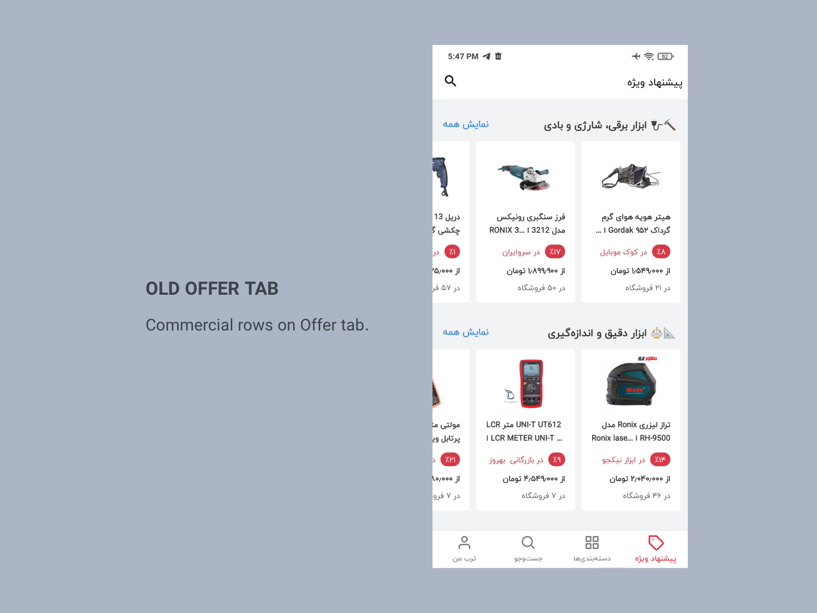
Poor Onboarding: The Offer page was the first thing that users saw after opening the Android app. There was a long list of products promoted by sellers (commercial row) and there were not any clues for users about searching and price comparison which are the main mission of Torob.
Poor Experience For Window Shopper Persona: Based on our surveys and data from the Offer page, we detect a Persona who likes exploring the app and don't intend to buy a specific product. We called this persona Window Shopper. Torob didn't show new products and trends on the app which had a bad effect on this persona.
Solutions and Tests
1. Hand-Picked Content On First Page: In co-op with the marketing team, we consider different ideas and decided to add some new rows on the Offer page which presented a collection of new and favorite products on the Offer page. We wanted to measure the effect of these hand-picked content on Window Shopper persona behavior. The results were pretty good and it cause a rise in clicks (directly related to revenue) and session time on the Offer page. Therefore we designed a panel for the marketing team to facilitate hand-picking products and collecting deeper data to measure the effect of any row on the Offer page
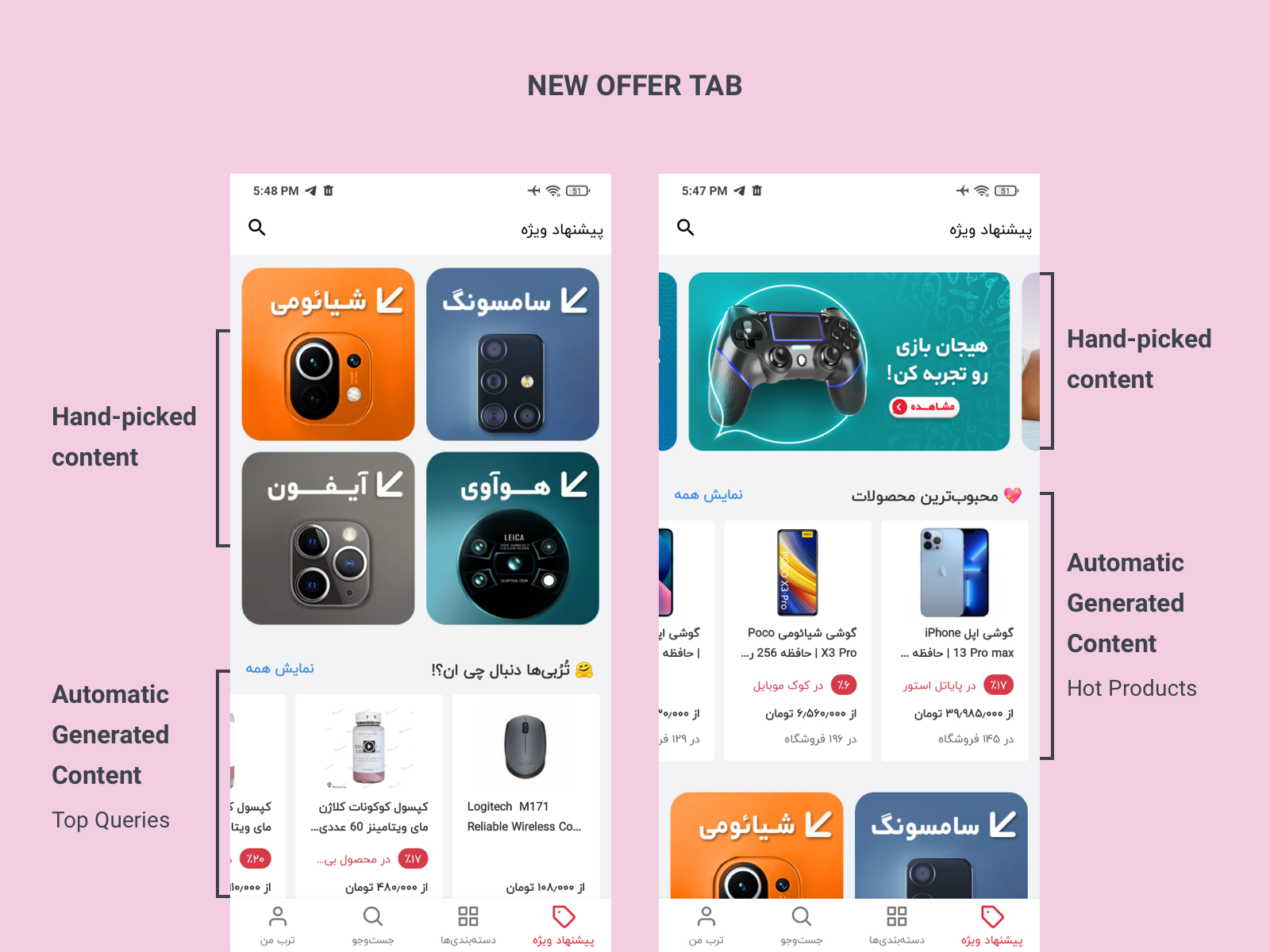
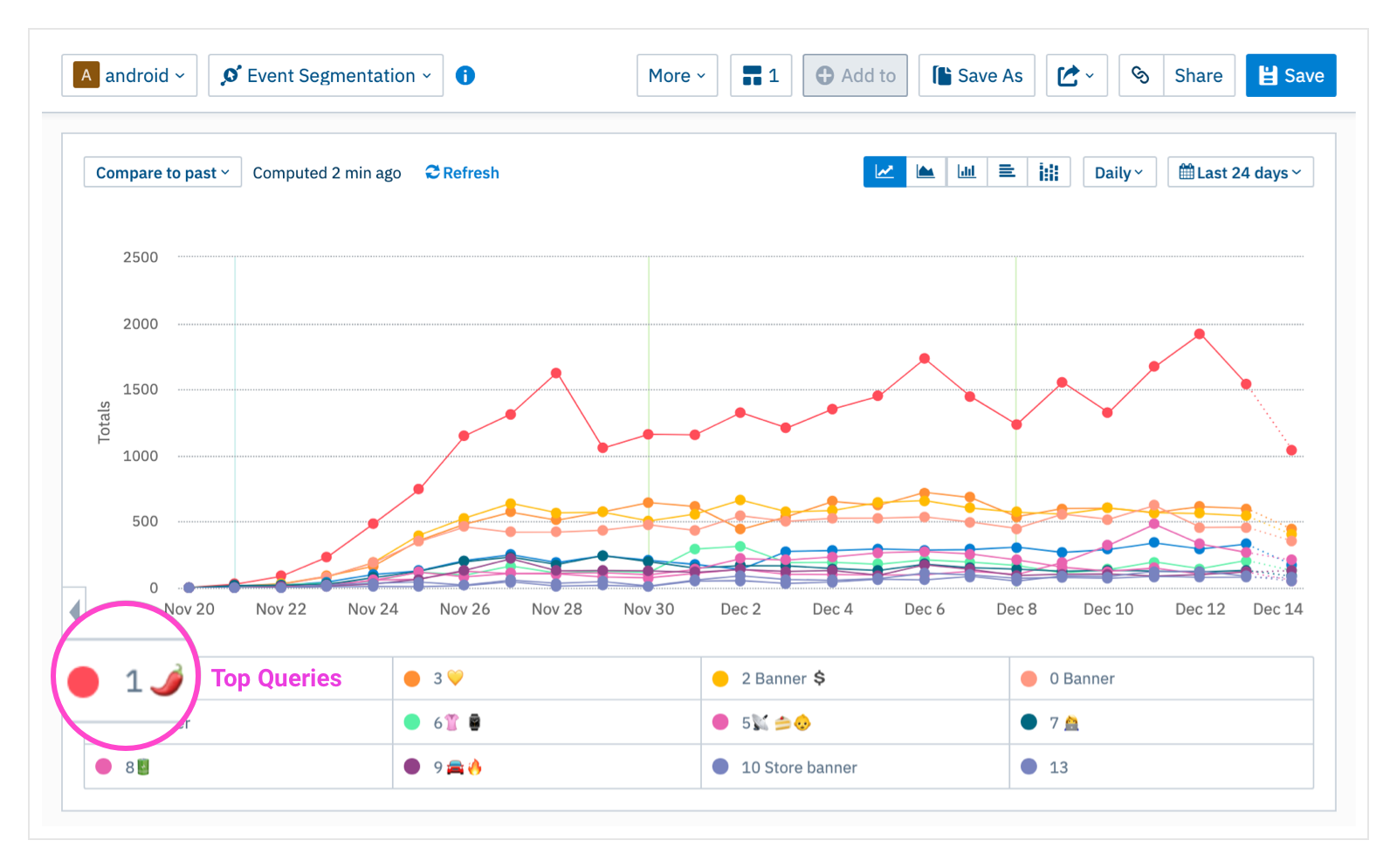
2. Automatic Generated Content On First Page: As another test, we added some rows to the first page based on the Top Queries which is explained in Case 2. We found in some layouts we got 2 times more clicks in comparison to other rows. The below chart shows daily clicks on every row on the Offer Page and the red line 🌶 shows the effect of Top Queries related rows. So we created some automatic lists of products based on Top Queries and Top Views which could be presented like hand-picked content on the first page.
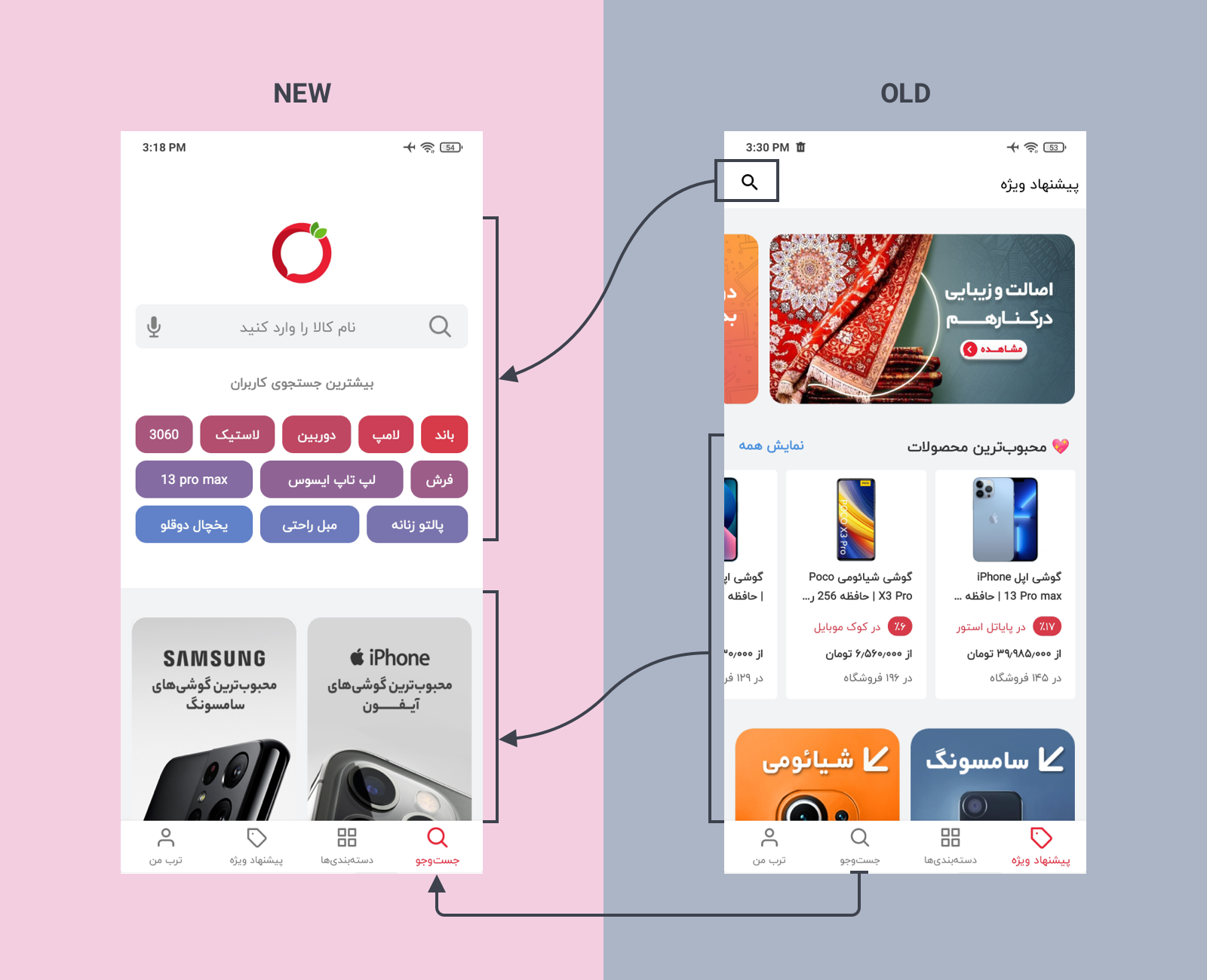
3. Spotlight On Search: The main experience of Torob was searching but in the first page of app, we just represented it by a small icon. We needed to put a spotlight on search. As explained in case 2, we had a successful experience on redesigning search tab. So we decided to test switching Search tab with Offer tab. We merge the best practices of Search tab with hand-picked content and leave commercial rows on Offer tab.
Results
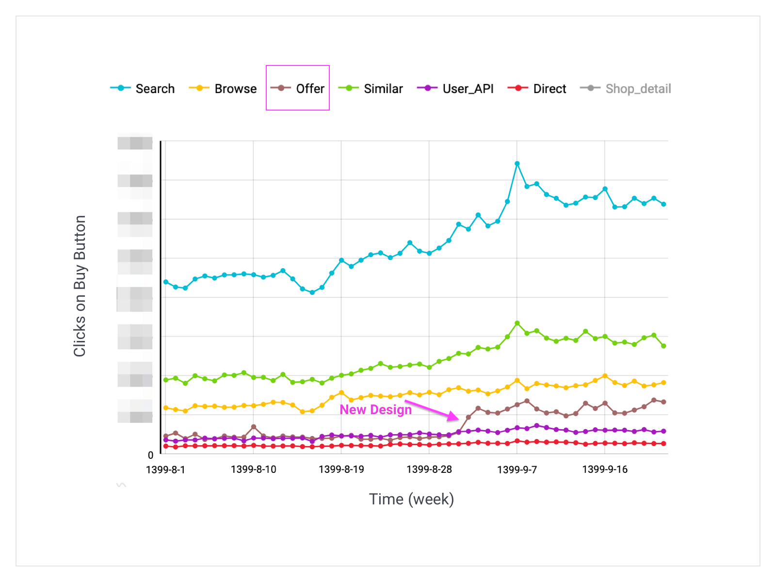
1. Increase Of Revenue: The chart below shows clicks on the Buy Button grouped by different sections of the Android app. The Buy Button has a direct relation to revenue. Here you can see the effect of the new design on the Offer page. The number of clicks on the Buy Button on the Offer Page increased 3 times on average. Also, it had a positive effect on search and similar sections. So the new design increased overall clicks and revenue in the Android app.
2. Improving The On-Boarding Of New Users: The new version cause a slight rise in retention and session time.
3. A New Playground For Marketing: The new design allowed the marketing team to be more creative in creating the contents of the app. It allowed them to show reactions to trends and new products and presented them in more attractive ways for the Window Shopper persona.